 Environments and Professionalism Listen to Ms. Thompson read this post on PodOmatic! 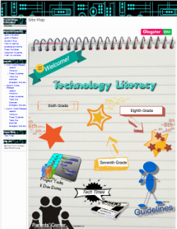 | My adventures teaching three technology courses began in August of 2011, as I designed our class website. You can view it by clicking here. I use this website daily to communicate directions to students, for sharing resources and web tools, and to store/display course documents and files for downloading. Google Sites is the platform of my class website. I like Google Sites because it is free, reliable, and fairly easy to customize. The first thing I learned while designing the site was that it is easier to start with a blank template. I figured out how to decorate the border and trim with clip art from OpenClipArt.org. Remembering the way a colleague had embedded a glog to serve as a sitemap on her class website, I did the same. Only, I took it a step further by connecting the sitemap glog to three different chalkboard glogs--one for each grade level--to serve as "Message of the Day" pages and resource zones. Students access the message glogs by clicking on their designated sitemap stars. Past What did not work? During the 2011-2012 school year, I think my directions on the class website were too wordy and there were way too many links, making the pages appear cluttered and overwhelming. Another problem was that the default font size, Verdana 10, was too small and difficult to read. Since the glogs are not accessible on devices without Flash, I back up them up in text format. This system is also useful to students who are absent or have some other reason to look at previous lessons, after the chalkboard has been updated. Here is an example of how these backup pages used to look: The Old Way. I began noticing that the more text presented all at once, the less students would read. They seemed to prefer immediately clicking links. Then would become confused about what to do. Present What is working? This year I am using a larger font. I have worked to reduce the amount students must read all at once on the website and the number of links appearing on a page. I have accomplished this by 1) creating and connecting more glogs to the site which are more palatable, with their fun and colorful fonts and clipart links (I will discuss these glogs in another post) and 2) linking my glog backups to their own separate pages, reserved to be seen only during situations when, for what ever reason, students cannot view the glog version. Here is how the backup pages look today: The New Way. What is not working? Students are still "click-happy". It is difficult to get them to read all of the directions carefully. As a result, there is still too much confusion about what to do and where to find site resources. Future What are some goals for future implementation? To help students become more comfortable with the site, I would like to one day try out a website scavenger hunt and/or a site navigation tutorial created by a student in exchange for extra credit. Other ideas I am considering are possibly restructuring the site for clarity and creating a comprehensive syllabus for each course. The syllabus would list all homework, class work, and project task due dates on one page, so that students can avoid searching several different places to view due dates. Thank you for reading! ____________________________________ Any additional ideas are very much welcome! If you hover over "Blog" in the top navigation bar, you will see tabs for two pages: "About Blog", where I explain a bit more about the purpose of this blog and how it is structured and "Topic Ideas" where you can communicate to me any ideas you would like addressed in future blog posts. I also invite you to comment below and to subscribe to receive the latest posts via e-mail. |
|
0 Comments
Leave a Reply. |
AboutThis blog, "The Perfect Course", is to document my efforts in refining the various courses I teach. 
@msthompsonmms


My SubscriptionseSchool News
IT Babble Not Another History Teacher Pivotal Education School Improvement Network Technology Tidbits Teaching Channel Archives
May 2013
Categories
All
|
